Scientific Presentation Design Guide
Design scientific presentation slides that make research clear for conferences, stakeholder meetings, biotech teams, and investor audiences.

Scientific illustration and research communication studio
Published 27 July 2026
Last updated 27 July 2026 · 5 min read

What makes a scientific presentation effective?
An effective scientific presentation gives the audience a clear reason to follow the research, enough evidence to trust the conclusion, and a visible implication. The slides support that argument rather than functioning as a projected paper.
Google Trends shows substantially broader search interest for scientific presentation than for narrower terms such as graphical abstract template or electronic scientific poster. That makes presentation guidance an important entry point for researchers and for biotech, environmental, materials, and health companies preparing stakeholder conversations.
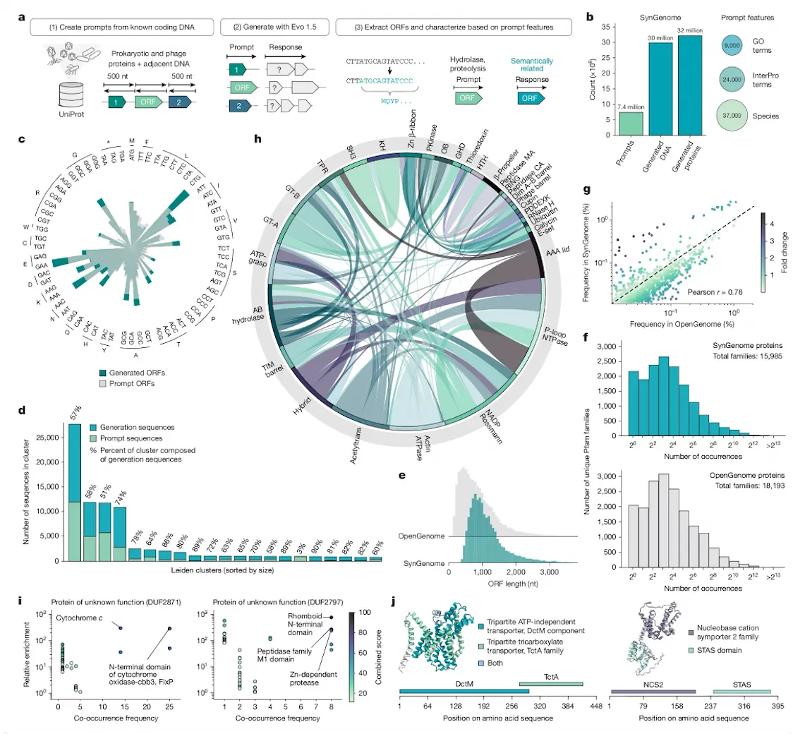
MIT’s AeroAstro Communication Lab slide-design guide recommends analysing the audience and context before designing slides. It also warns against copying dense paper figures directly into presentations because irrelevant data and small labels distract from the slide’s main message.
How should you plan a scientific slide deck?
Plan the argument before formatting slides. Write the audience, purpose, time limit, and desired outcome at the top of the brief.
Clarify:
- Who is in the room?
- What do they already know?
- What decision, question, or action follows the talk?
- Which evidence is essential for that outcome?
- What can move to backup slides?
Then create a sentence-level story:
- This is the problem or opportunity.
- This is what is missing or uncertain.
- This is our approach.
- This is the strongest evidence.
- This is what the evidence means.
- This is the implication or next step.
Only after this sequence works should you design individual slides.
How should the structure change for different audiences?
The scientific core stays accurate, but emphasis and vocabulary should change with the audience’s needs.
| Audience | Primary emphasis | Evidence treatment |
|---|---|---|
| Research conference | Novel contribution and method | Technical figures with essential detail |
| Biotech leadership | Decision, risk, and development path | Ranked findings and milestones |
| Investor or partner | Unmet need, differentiation, and validation | Clear claims linked to defensible proof |
| Public or policy audience | Meaning, relevance, and consequence | Plain-language visual explanations |
| Internal project team | Progress, blockers, and next actions | Operational metrics and open questions |
Do not remove uncertainty for non-specialist audiences. Translate it into understandable visual and verbal terms.
What should each research slide contain?
Each slide should have one communication job and one dominant visual hierarchy. The slide title should state the takeaway whenever the evidence supports a concise conclusion.
A strong evidence slide often contains:
- a message title;
- one main chart, image, or diagram;
- direct annotation of the key comparison;
- a short source or method note;
- optional context needed to interpret the evidence.
Move detailed citations, secondary controls, and additional analyses to a consistent footer or backup section. Do not use a generic title such as “Results” when the slide can state the actual finding.
How do you adapt scientific figures for slides?
Adapt figures by preserving the data while changing the presentation layer. Remove panels that are not discussed, enlarge labels, simplify legends, and annotate the evidence as it is introduced.
Use this sequence:
- identify the one comparison the audience needs;
- isolate the relevant panel or rebuild the chart from source data;
- enlarge type, marks, and annotations;
- reduce non-essential gridlines and decoration;
- highlight the relevant series without hiding other data;
- add a concise source and method note;
- verify that the visual remains scientifically faithful.
The scientific data visualization guide explains how to choose charts, encode uncertainty, and use accessible colour.
What font sizes and layouts work for scientific presentations?
Font sizes must work for the room, screen, and audience. Test the actual presentation on a comparable display rather than choosing size from a desktop monitor.
A practical starting hierarchy for 16:9 slides is:
- 32-44 pt message titles;
- 24-32 pt body or annotation text;
- 20-24 pt source notes only when necessary;
- chart labels no smaller than the surrounding explanation.
These are starting points, not fixed rules. Large lecture halls may require more generous sizes.
Use stable margins, align objects to a small set of guides, and keep recurring elements in the same location. Microsoft’s PowerPoint grid and guide documentation explains how guides support alignment without appearing during the slide show.
How should colour and motion be used?
Colour should help the audience track meaning across the deck. Use the same colour for the same condition, product, group, or pathway throughout.
Motion should reveal sequence or change. Appropriate uses include:
- introducing steps in a mechanism;
- building a complex chart in a controlled order;
- comparing before and after states;
- moving from system overview to detail.
Avoid decorative transitions, continuous movement, and animations that change the perceived data. Provide an understandable static state for exported PDFs and reduced-motion contexts.
How do you design a slide deck for biotech or industry?
Industry decks need scientific credibility and decision clarity. The audience may include researchers, executives, commercial teams, regulators, partners, and investors with different technical depth.
Build a layered narrative:
- plain-language headline;
- defensible technical evidence;
- clearly stated limitations;
- development stage and next milestone;
- decision or collaboration request.
Separate measured outcomes from projections. Use labels such as observed, modelled, planned, or illustrative where needed. A visually confident deck should not make an early result look more mature than it is.
Explore presentation and digital communication examples to see how posters, slides, and research microsites can use one visual system.
What should you check before presenting?
Rehearse the communication, not only the words. Test timing, slide order, visual legibility, transitions, and technical backup.
- The opening establishes relevance quickly.
- Every slide has one clear job.
- Main figures are readable from the back of the room.
- Acronyms are introduced or removed.
- Claims and uncertainty match the evidence.
- Citations are present where needed.
- Videos and animations work offline.
- Fonts and symbols render on the presentation computer.
- A PDF backup is available.
- Backup slides answer likely technical questions.
Microsoft’s speaker-notes guidance can help separate the spoken explanation from what belongs on screen.
When should you hire a scientific presentation designer?
Specialist support is useful when the deck must translate complex evidence across audiences, align with a company identity, or support a high-value decision.
Consider professional support for:
- conference keynotes and invited talks;
- biotech investor or partner decks;
- launch and milestone presentations;
- grant or impact showcases;
- decks with custom scientific illustrations;
- presentations that must become posters, reports, or microsites.
View selected slide work or contact Lattice Visual to turn a manuscript, dataset, or technical brief into a presentation system.