Scientific Data Visualization Guide
Choose clearer charts, colour palettes, annotations, and figure structures for accurate, accessible scientific data visualization.

Scientific illustration and research communication studio
Published 27 July 2026
Last updated 28 July 2026 · 6 min read
What is scientific data visualization?
Scientific data visualization is the design of charts, diagrams, maps, networks, and multi-panel figures that help readers interpret evidence accurately. It is part of analysis and scientific communication, not decoration added after the analysis is complete.
A 2026 Nature Human Behaviour article on designing effective scientific figures emphasises that figures strongly influence how findings are interpreted. The design process therefore needs to account for audience, task, evidence, and context as well as journal specifications.
Good visualization makes the intended comparison visible while preserving:
- sample structure;
- variation and uncertainty;
- measurement scale;
- missing or excluded data;
- relevant baselines;
- the distinction between observation and interpretation.
How do you choose the right chart?
Choose a chart by the question the reader must answer, not by the chart type that looks most impressive.
| Reader question | Useful chart | Main caution |
|---|---|---|
| How do groups differ? | Dot plot, interval plot, box or violin plot | Show sample size and variation |
| How does a value change over time? | Line chart or small multiples | Use an honest time scale |
| How are variables related? | Scatterplot with model or uncertainty | Do not imply causation |
| What is the distribution? | Histogram, density, ECDF, or violin plot | Bin and smoothing choices matter |
| How does composition change? | Stacked bars or area with direct labels | Middle segments are hard to compare |
| How are entities connected? | Network or chord diagram | Dense links can hide structure |
| Where does something occur? | Map or spatial field | Projection and area affect perception |
Avoid choosing a pie chart, network, or 3D chart solely because it appears more visual. If the audience needs precise comparison, position on a shared axis is often clearer.
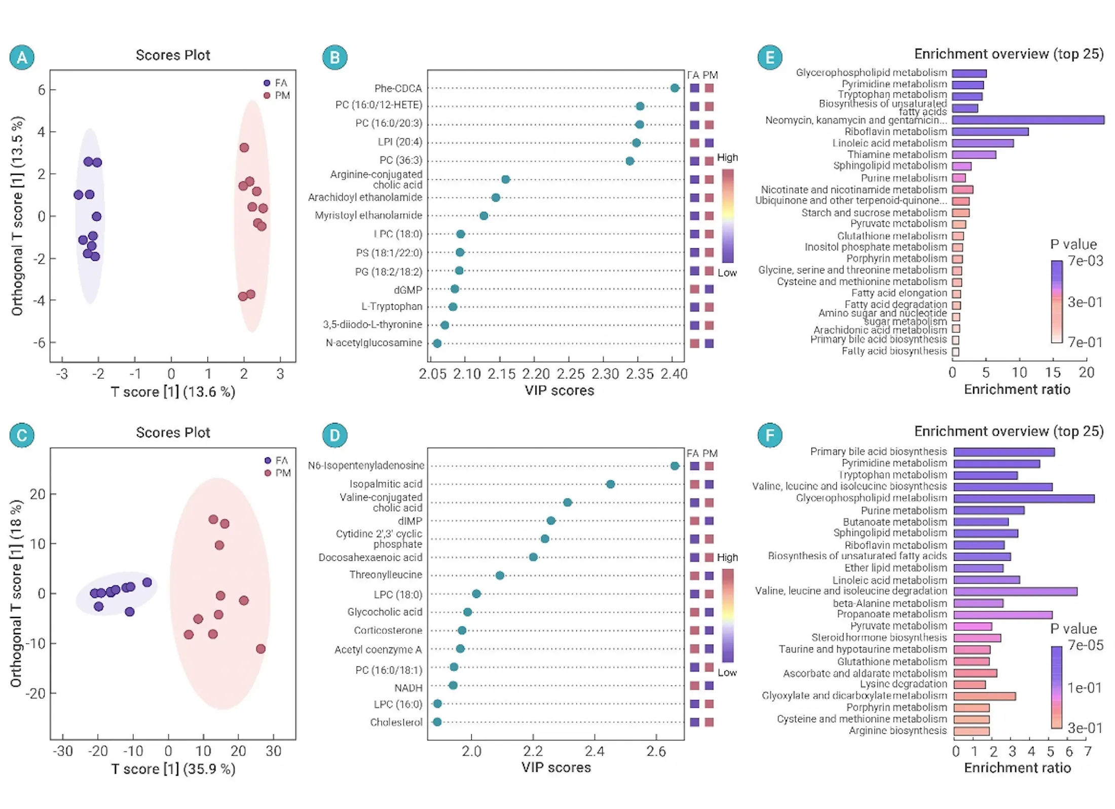
Different chart forms answer different analytical questions: score plots show group separation, ranked dots identify influential metabolites, and enrichment bars summarise affected pathways.
When should you use networks, chord diagrams, and Sankey plots?
Use relational visualizations only when connection structure or flow is itself part of the scientific question. A network reveals linked entities, a chord diagram compares many-to-many relationships, and a Sankey plot shows how quantities or categories move between defined stages.
Dense relational graphics need aggressive hierarchy. Label only the nodes that carry the argument, distinguish positive and negative relationships with more than colour alone, and provide a simpler supporting view when readers need precise values.
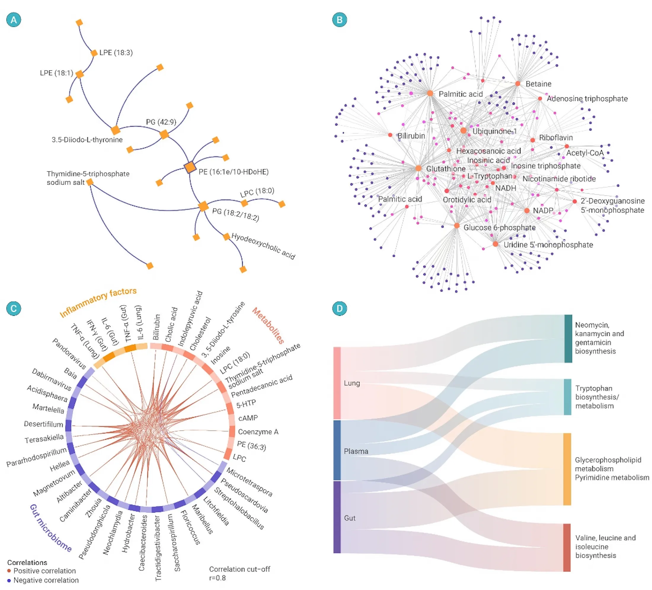
Four relational structures serve different jobs: hierarchy, network centrality, cross-domain correlation, and flow between biological compartments and enriched pathways.
How should scientific figures show variation?
Scientific figures should show the structure of the data whenever that structure affects interpretation. A mean alone can hide skew, outliers, clusters, pairing, and small sample sizes.
Depending on the study, show:
- individual observations;
- distribution shape;
- confidence or credible intervals;
- paired measurements;
- repeated measures or hierarchical grouping;
- model predictions and uncertainty;
- sample size and missing-data notes.
Do not add jitter, smoothing, or aggregation without understanding how it changes perception. A clean figure is not one that removes inconvenient variation.
How should colour work in scientific data visualization?
Colour should encode variables accurately and remain accessible to readers with different colour vision. Categorical, sequential, and diverging data require different palette logic.
The open-access review Choosing Suitable Color Palettes for Accessible and Accurate Science Figures explains why colour choice affects both accessibility and scientific accuracy. Perceptually uniform gradients are especially important when colour represents numerical magnitude.
Use:
- categorical colours for distinct unordered groups;
- a light-to-dark sequential palette for increasing values;
- a diverging palette only when a meaningful centre exists;
- consistent group colours across related figures;
- labels, patterns, or line styles alongside colour.
Avoid rainbow scales, automatic red-green comparisons, low-contrast pastel series, and palettes where equal numerical steps appear visually unequal.
Convert the figure to grayscale and use a colour-vision simulator before publication. If groups disappear, add redundant cues.
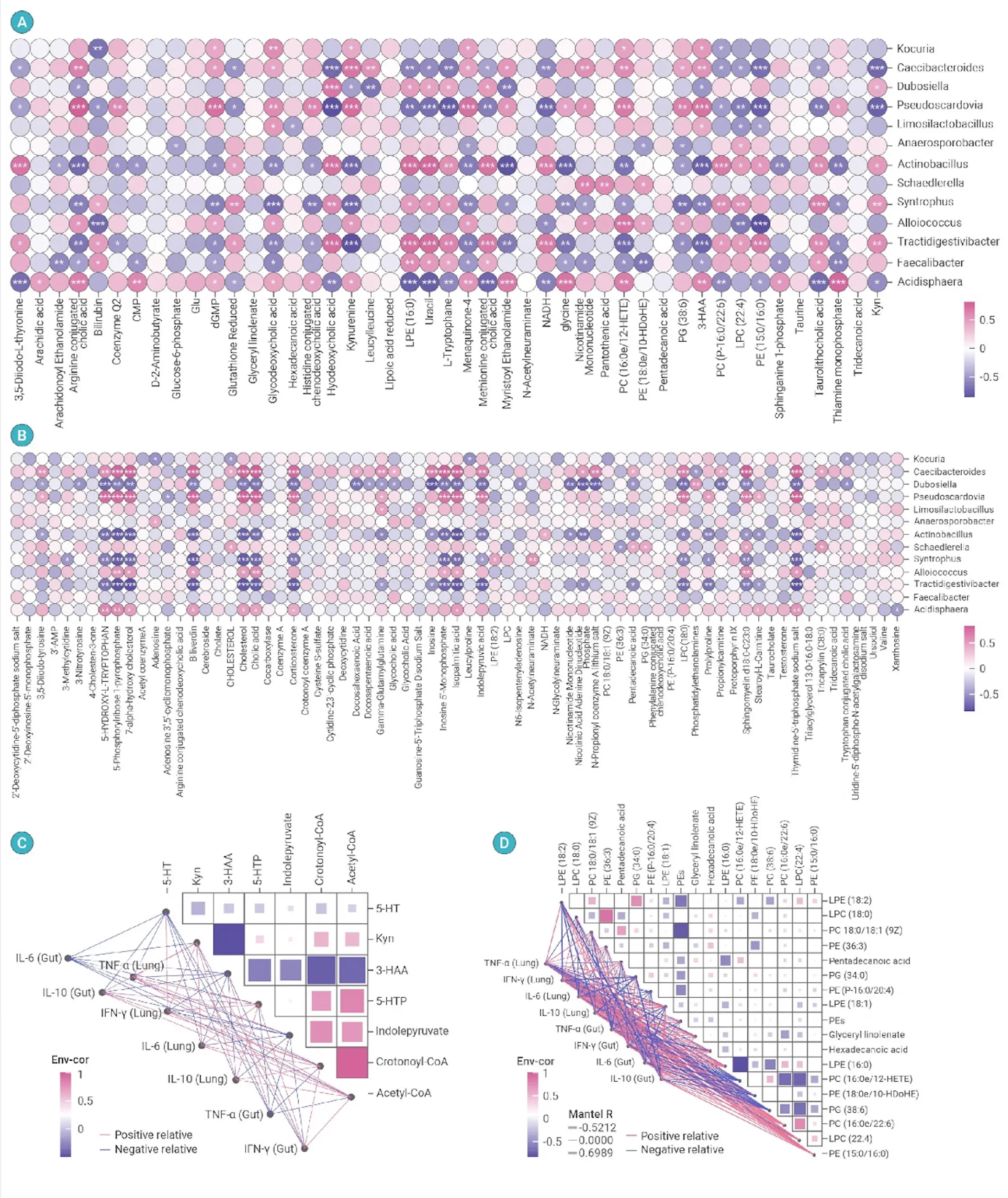
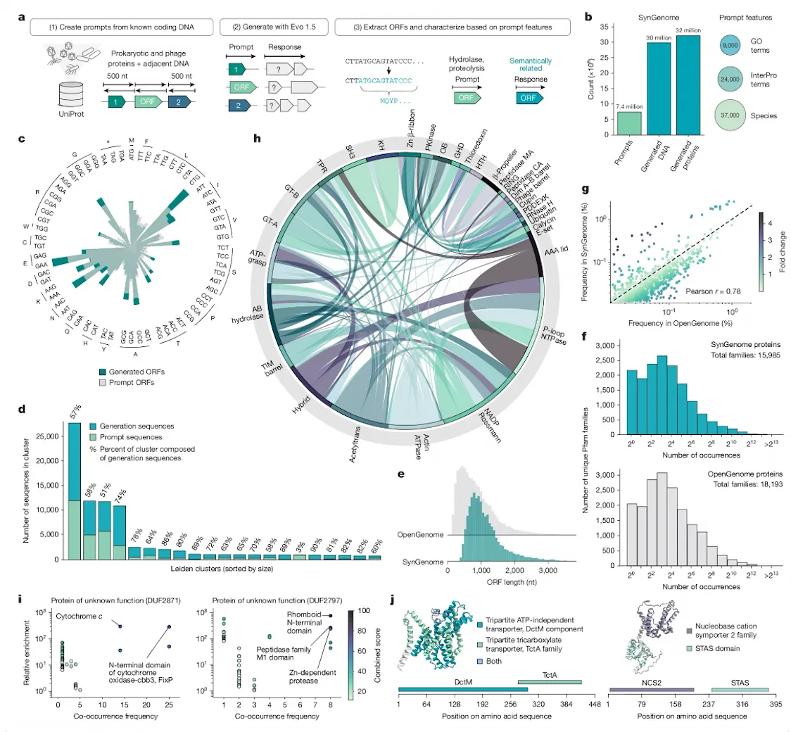
A diverging palette encodes correlation direction while circle size and significance symbols provide additional cues. Repeated scales and labels make the dense panels comparable.
How do labels and annotations improve a figure?
Direct labels reduce the work required to match marks with a distant legend. Annotation can explain the intended comparison without turning the figure into a poster.
Useful annotations include:
- short message titles;
- labels next to lines or groups;
- arrows pointing to a specific change;
- brackets defining anatomical or material regions;
- scale bars and units;
- notes identifying modelled or normalised values;
- concise source and method information.
Keep annotation close to the evidence it explains. Use one visual style for the same annotation function throughout a figure set.
How should multi-panel scientific figures be organised?
Multi-panel figures should make the argument progress in a logical sequence. Panel order, size, and alignment tell the reader what matters.
A reliable sequence might move from:
- study design or system;
- primary measurement;
- validation or mechanism;
- comparison or robustness;
- integrated model or conclusion.
Align related axes and use consistent scales where comparison is intended. Place legends, colour bars, and panel labels in predictable positions.
PLOS Biology’s figure preparation guidance also stresses scientific integrity in image preparation. Global contrast or background adjustments must not selectively alter the information shown.
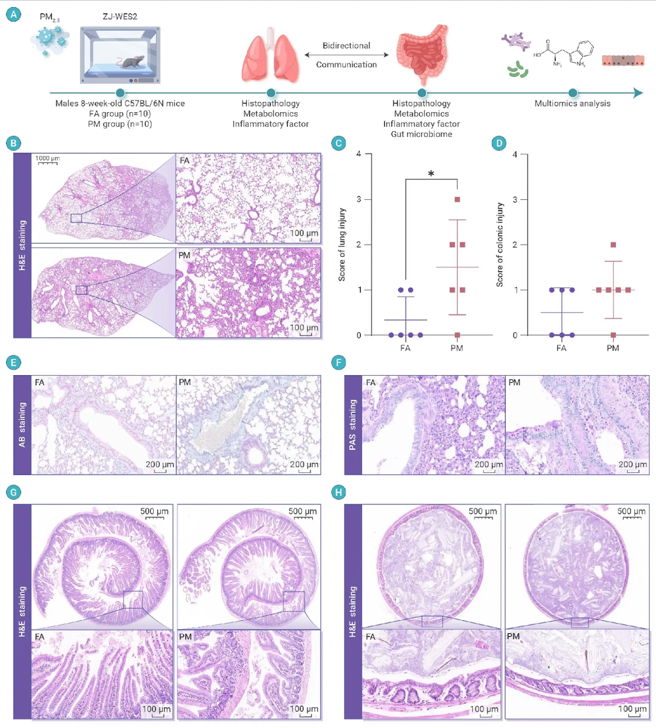
The figure moves from study design to representative tissue images, quantitative injury scores, and organ-specific validation while keeping panel labels and group colours consistent.
How do you design for journals, slides, and digital media?
One source figure rarely works unchanged across every format. Preserve the underlying data and claim while adapting the presentation layer.
For journal figures:
- follow exact dimensions and file requirements;
- retain enough detail for close reading;
- use complete captions and panel labels.
For presentation slides:
- isolate the comparison being discussed;
- enlarge labels and marks;
- annotate the relevant result directly.
For web and interactive use:
- provide responsive layouts;
- support keyboard and touch interaction;
- include accessible alternatives and descriptive text;
- avoid hover-only explanations.
The scientific presentation design guide shows how to adapt publication figures for a live audience.
What should a scientific figure caption do?
A figure caption should identify the evidence, explain necessary methods and abbreviations, and help the reader interpret the panels without searching through the main text.
Use:
- a short title stating the subject or finding;
- panel-by-panel explanation in reading order;
- sample and condition definitions;
- statistical test and uncertainty definitions where required;
- scale, units, and abbreviation definitions;
- source or adaptation information.
Do not use the caption to rescue an unreadable figure. Labels, legends, and structure still need to work inside the visual.
What are the most common scientific visualization mistakes?
Common mistakes include:
- truncated axes that exaggerate differences without clear justification;
- bar charts that hide individual data and distributions;
- inconsistent colours for the same group;
- legends that require repeated eye movement;
- labels too small for the publication or presentation size;
- decorative 3D perspective that distorts magnitude;
- too many panels with no visible hierarchy;
- colour-only encoding;
- image enhancement that changes scientific information;
- causal language applied to correlational evidence.
Review the figure with a domain expert and with someone outside the immediate project. They test different types of comprehension.
What is the final data visualization checklist?
The final check should cover analytical validity, perceptual clarity, accessibility, and output quality.
- The chart type matches the scientific question.
- Axes, units, and scales are explicit.
- Variation, uncertainty, and sample size are represented appropriately.
- The intended comparison is easy to find.
- Colour is accurate and accessible.
- Labels and annotations remain legible at final size.
- Related panels use consistent scales and visual encoding.
- Image adjustments preserve scientific integrity.
- Captions define panels, methods, and abbreviations.
- The exported file meets journal or platform requirements.
View research visualization examples or contact Lattice Visual for publication figures, presentation-ready data stories, and interactive research reports.