Scientific Poster Design Checklist (2026)
Use this scientific poster design checklist to improve layout, font sizes, figure hierarchy, accessibility and print-ready export.

Scientific illustration and research communication studio
Published 27 July 2026
Last updated 27 July 2026 · 6 min read
What makes a scientific poster effective?
An effective scientific poster makes one research argument easy to find from several metres away. It does not require the viewer to read every paragraph in sequence before understanding the question, evidence, and conclusion.
The University of Minnesota’s poster design guidance recommends focusing the message, matching the audience, using visual communication, and making the poster readable from roughly four to six feet away. Those principles are more durable than any fashionable layout.
A strong poster should let a viewer answer three questions quickly:
- What is this research about?
- What did the team find or propose?
- Where should I look for the evidence?
If those answers are hidden in dense text, improving colours or adding icons will not fix the underlying hierarchy.
What should you confirm before designing?
Confirm the event’s size, orientation, file, and display requirements before opening a template. A poster designed at the wrong dimensions can be difficult to resize without altered line breaks, distorted figures, and reduced text.
Collect:
- maximum width and height;
- portrait or landscape orientation;
- physical board or digital-screen dimensions;
- accepted file type and maximum file size;
- printer margin, bleed, and colour requirements;
- submission deadline and naming convention;
- required logos, acknowledgements, or disclosure text.
The University of Alabama at Birmingham’s poster design guidance notes that a poster only needs to fit within the available display area; it does not always need to fill the complete board.
What is the best scientific poster layout?
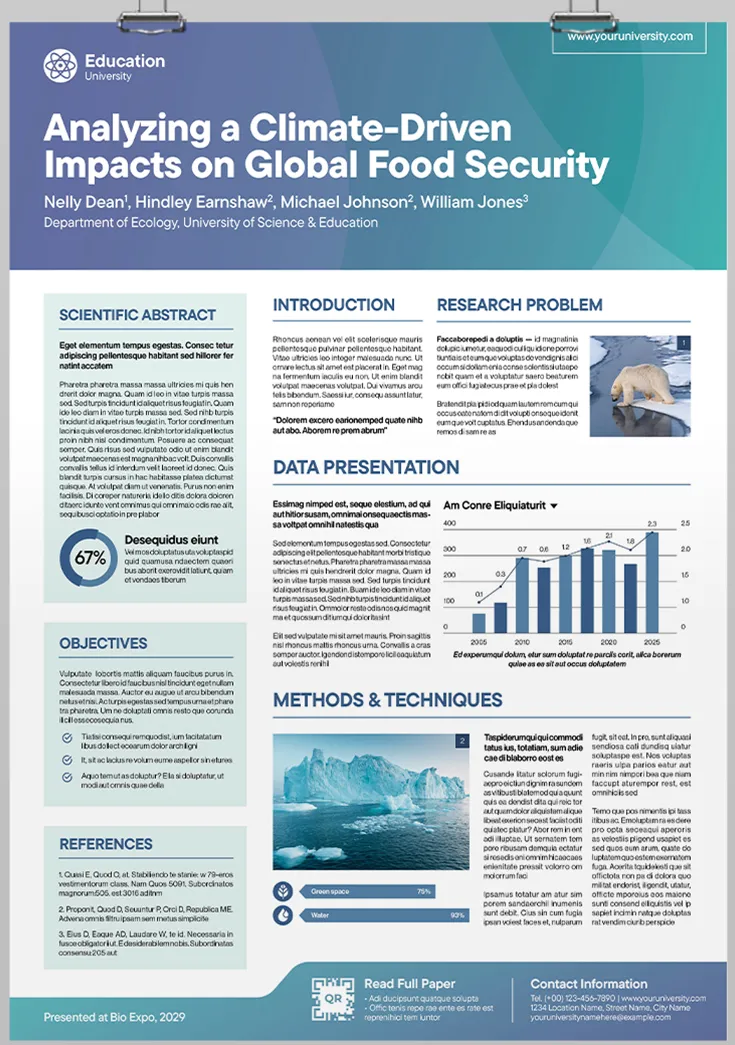
The best layout creates one obvious reading path and gives the main evidence more space than background or procedural detail. A conventional three-column layout is reliable, but it is not mandatory.
Choose the structure that matches the story:
| Layout | Works well for | Main risk |
|---|---|---|
| Three columns | Conventional research narratives | Every section can look equally important |
| Central result | One dominant figure or finding | Supporting method may feel disconnected |
| Horizontal journey | Processes, timelines and mechanisms | Long reading distance on large boards |
| Modular panels | Several related findings | Too many boxes create visual noise |
Start with the conclusion and principal figure, then add only the context and method needed to interpret them. This reverses the common workflow of pouring the entire manuscript into columns and trying to create hierarchy afterwards.
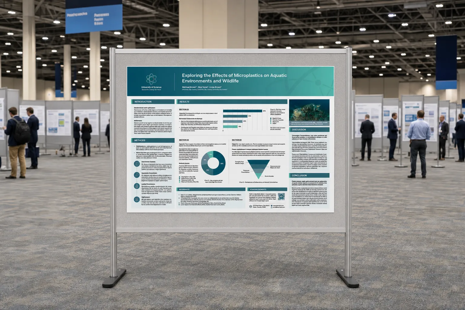
Our scientific poster examples guide analyses how layout, type, and evidence can work together.
How much content should the poster include?
Include enough content to support the main conclusion, not enough to reproduce the paper. Posters are conversation tools and visual summaries, not wall-mounted manuscripts.
A practical content order is:
- short, informative title;
- one-sentence research question or purpose;
- minimal background;
- method shown as a diagram or compact sequence;
- dominant results figures;
- visible conclusion;
- implications or next step;
- authors, affiliations, acknowledgements, and contact details.
Delete repeated explanations between body text, captions, and legends. If a chart’s title already states the comparison, the paragraph beside it should explain the implication rather than restate the axis labels.
Turn long methods into a flow, experimental setup, or annotated image. Turn numerical lists into charts only when the visual form makes comparison easier.
What font sizes should you use?
Font sizes should be chosen for the final poster dimensions and viewing distance, then tested at full scale. University guidance varies because poster formats and venues vary.
The University of Minnesota suggests at least 18–24 pt body text, 30–60 pt headings, and a title over 72 pt. UAB gives a more generous starting point for a 36 × 48-inch poster: 85 pt title, 60 pt authors, 54 pt subheadings, 32 pt body text, and 24 pt captions.
Use those numbers as test ranges, not universal rules.
| Element | Starting range | Test |
|---|---|---|
| Title | 72–100+ pt | Readable across the aisle |
| Section heading | 36–60 pt | Scannable from several metres |
| Body text | 24–32 pt | Comfortable at conversation distance |
| Caption and label | 20–28 pt | Readable without leaning in |
Limit the type system to one or two families and a small number of weights. Use size, weight, and spacing consistently so the same visual treatment always signals the same content level.
How should figures and data be presented?
Figures should carry the central argument and remain legible without the original manuscript. Make the strongest chart, image, or mechanism the visual anchor instead of giving every figure equal size.
Check that:
- axes include labels and units;
- legends are close to the data they explain;
- colours remain distinct in grayscale and common colour-vision conditions;
- microscopy includes scale bars;
- captions state the takeaway, not only the method;
- panel letters and annotations are large enough at final size;
- screenshots and raster images have sufficient resolution.
The University of Texas poster design guidance recommends using charts and figures instead of simply listing data and checking that graphics are legible from at least three feet away.
For complex multi-panel figures, consider creating a simplified poster version rather than pasting the publication figure unchanged. The poster audience needs a guided comparison, not every supplementary panel.
How should colour and accessibility work?
Colour should organise the story and highlight evidence, not decorate every box. Use a quiet base, one main accent, and a limited set of data colours with explicit meaning.
Test:
- dark text on light backgrounds or an equivalently high-contrast alternative;
- labels and symbols in addition to colour-only distinctions;
- meaningful reading order without coloured section bands;
- charts in grayscale;
- QR codes and links at final output size.
The W3C minimum contrast guidance provides a useful benchmark for text and important labels. Print conditions differ from screens, but low-contrast combinations remain difficult in both.
Avoid placing body text over photographs, gradients, or detailed molecular imagery. If an image is essential behind text, add a solid or sufficiently opaque text field.
What should you check before exporting?
Check content, typography, imagery, permissions, and printer requirements in separate passes. A single final review encourages the eye to skip familiar errors.
Content check
- The title states the topic or finding clearly.
- The research question is visible.
- The conclusion can be found within a few seconds.
- Claims match the evidence.
- Abbreviations are defined or removed.
Design check
- One reading path is obvious.
- The primary figure dominates.
- Text is concise and left aligned where practical.
- Spacing and alignment are consistent.
- Colour is not the only carrier of meaning.
Technical check
- Page size and orientation match the event.
- Raster images are sharp at final scale.
- Fonts are embedded or safely exported.
- Links and QR codes work.
- The PDF has been opened and inspected on another device.
- The printer’s margin, bleed, and colour instructions are satisfied.
How do you test the poster before printing?
Test the poster at full size or through scaled print sections before committing to the final print. At minimum, print one representative area at 100% containing body text, a chart label, a caption, and an image.
Then run a distance test:
- view the title from across a room;
- view headings from several metres away;
- read body text at normal conversation distance;
- ask someone unfamiliar with the project to identify the conclusion;
- scan the QR code from a realistic position.
A screen zoomed to “fit page” hides problems because it changes the relationship between document size and viewing distance.
What is the final scientific poster checklist?
The final checklist is about communication before decoration: correct dimensions, one visible argument, dominant evidence, readable type, accessible colour, and a verified export.
Download the research poster grid template for a structured starting point. If the poster needs custom figures, a presentation deck, or an interactive follow-up, contact Lattice Visual to build the formats as one coherent research story.