Scientific Poster Design: Layout, Type, and Sizes
Design a clearer scientific poster with practical guidance on hierarchy, research poster sizes, typography, layout, and conference readability.

Scientific illustration and research communication studio
Published 20 June 2026
Last updated 26 July 2026 · 5 min read
What makes a scientific poster effective?
An effective scientific poster lets a viewer identify the research question, main evidence, and conclusion in seconds. It is not a manuscript enlarged to wall size; it is a visual prompt for a short, useful conversation.
Conference viewers often encounter a poster while walking, talking, and comparing many projects. The design therefore has to work at three distances:
- Across the aisle: the title and subject should be identifiable.
- At conversation distance: the main result and visual evidence should be legible.
- Up close: methods, caveats, captions, and references should remain available.
If all three distances show the same level of detail, the poster has no hierarchy. The strongest examples reveal information progressively.
What do effective scientific posters have in common?
Strong examples reduce competition between sections and give the conclusion meaningful visual priority. They tend to share five practical decisions.
First, the title states the subject or result without unnecessary framing. Second, one visual or result carries more weight than the rest. Third, sections are grouped by the logic of the research rather than given identical boxes. Fourth, text is edited into short explanations that can be discussed rather than silently read for several minutes. Fifth, the conclusion is visible without following every panel in order.
When reviewing a poster example, do not ask only whether it looks attractive. Ask whether the composition helps you answer:
- What problem is this project addressing?
- What did the researchers do?
- What is the most important result?
- What should happen next?
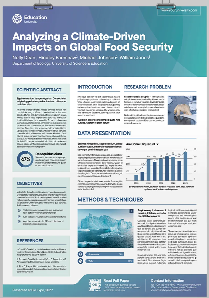
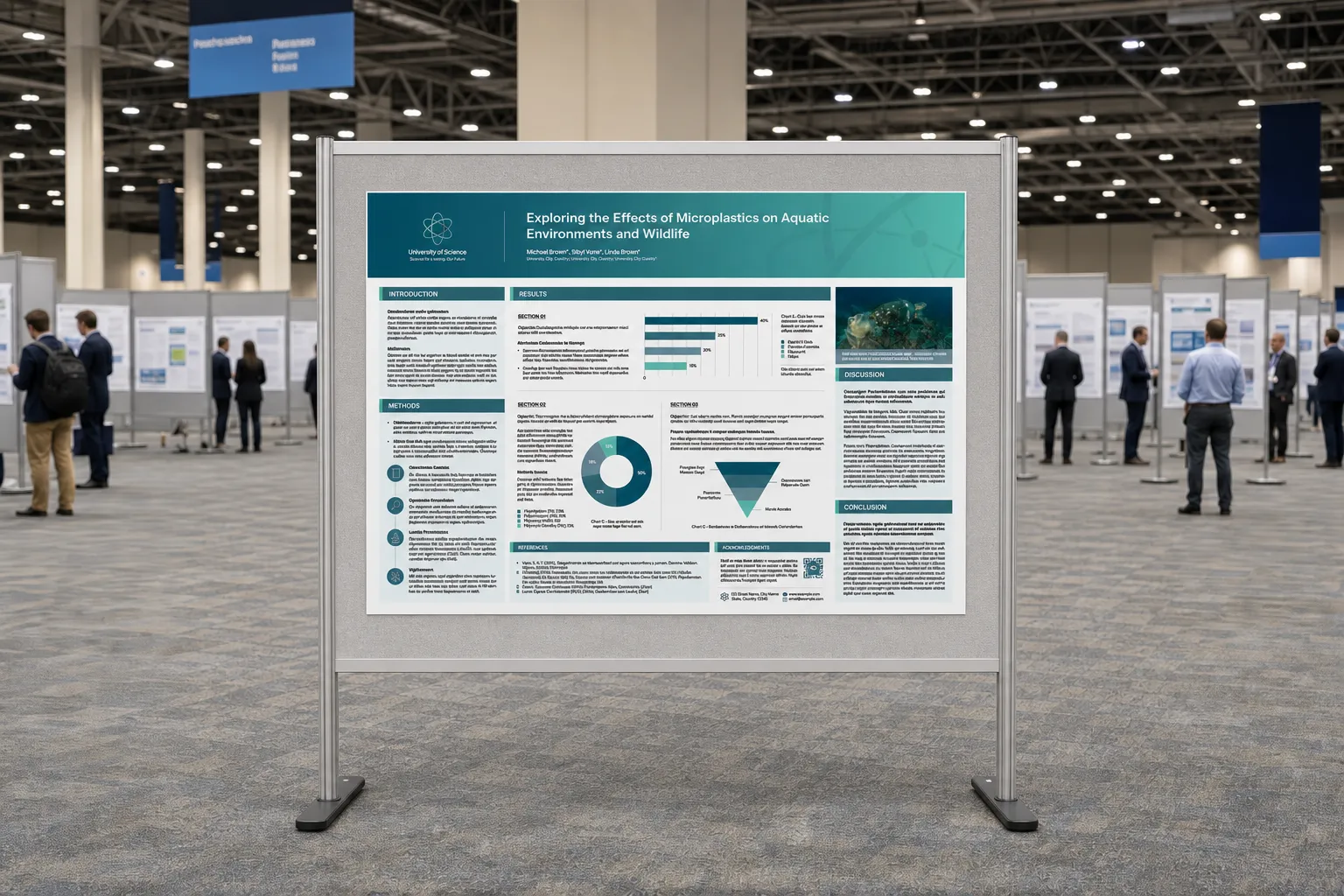
The poster in the hero image, for example, uses a restrained blue-green palette, a prominent title band, a central results region, and supporting material around it. A useful next refinement would be to enlarge the most important data story and shorten the paragraphs, so the research can be understood before the viewer begins reading closely.
What size should a research poster be?
The correct research poster size is the format specified by the conference or venue. Do not assume that an event accepts A0, landscape orientation, or a particular US size because a previous conference did.
Use the dimensions below only as planning references. Check the organiser’s current guidance before designing, and confirm whether the stated limit refers to the paper, the printable area, or the physical display board.
| Format | Dimensions | Typical use |
|---|---|---|
| A0 | 841 × 1189 mm | European academic conferences |
| 36 × 48 | 914 × 1219 mm | North American conferences |
| A1 | 594 × 841 mm | Compact displays and internal events |
Set the document at final size from the beginning. Scaling up a slide-sized layout at the end can produce weak typography, thin rules, low-resolution images, and unpredictable line breaks. If the printer requests bleed or crop marks, add them only after confirming the production specification.
What font sizes work on a scientific poster?
Scientific poster typography should be chosen for real viewing distance, not laptop comfort. Point-size ranges are useful starting points, but the final decision depends on typeface, line length, contrast, print quality, and the distance between the viewer and the board.
| Element | Planning range | Final check |
|---|---|---|
| Title | 72–110 pt | Readable across the room |
| Section heading | 36–54 pt | Scannable at a glance |
| Body | 24–34 pt | Comfortable at conversation distance |
Print a representative section at 100% scale before approving the design. It should include a heading, body paragraph, figure label, axis text, and caption. Pin it to a wall and review it from the distance at which a conference conversation would normally take place.
Avoid setting important text over photographs, gradients, or complex illustrations unless the local contrast has been tested. The W3C minimum contrast guidance is written for digital content, but its principle is useful for posters too: text, including text baked into images, must remain distinguishable from its background.
How should a research poster be structured?
A research poster should follow the logic of the argument rather than forcing every manuscript heading into equal boxes. Three structures work particularly well:
When should you use a results-first layout?
A results-first layout is useful when one finding is the clear reason to stop and look. Place the headline result or key figure near the visual centre, then arrange methods and supporting evidence around it.
When should you use a narrative layout?
A narrative layout is useful when the sequence itself matters. A clear reading path can move from problem to method to evidence to implication, but it should not require small arrows between every panel.
When should you use a modular layout?
A modular layout is useful when viewers may enter the project from different questions. Each module should make sense independently while sharing a consistent heading, caption, and data style.
Whichever structure you choose, use alignment to create relationships. A poster rarely needs a visible border around every section; white space and consistent edges can provide enough separation with less visual noise.
Can you start from a scientific poster template?
A template can accelerate spacing and print setup, but it should not dictate the hierarchy of the research. Start with a template when you need reliable dimensions, margins, and style consistency across a programme or institution.
Before using one, check:
- the document matches the conference dimensions and orientation;
- the columns suit the actual argument rather than the template preview;
- placeholder charts can be replaced without changing the visual balance;
- headings, body text, captions, and references remain legible at final size;
- colours and logos meet institutional requirements without weakening contrast;
- the layout leaves room for a QR code, contact details, and accessibility information only when those items serve the audience.
A good template is a production system, not a finished communication strategy. Remove any module that does not help the viewer understand the project.
The final test is conversational: can the poster support a clear two-minute explanation without forcing the presenter to read it aloud? If so, the design is likely doing the right amount of work.