10 Graphical Abstract Design Rules: A Practical Checklist
Apply ten evidence-informed rules for clearer graphical abstracts, covering message, layout, arrows, text, colour, tools, and feedback.

Scientific illustration and research communication studio
Published 22 August 2026
Last updated 22 August 2026 · 8 min read
What are the ten rules for designing a graphical abstract?
The ten rules move from defining the message to testing the finished visual, treating graphical abstract design as a communication process rather than a decoration task. They come from Helena Klara Jambor and Martin Bornhäuser’s 2024 open-access paper, Ten simple rules for designing graphical abstracts, published in PLOS Computational Biology.
The framework can be summarised as follows:
- define the key message for a specific audience;
- choose pictures and pictograms with a consistent visual style;
- use data or charts only when they carry the main message;
- design for the required dimensions and final display size;
- create an obvious reading direction;
- use arrows, spacing, and grouping to connect ideas;
- keep text concise and integrated with the visuals;
- use colour to encode meaning and maintain accessibility;
- choose tools that support the required output quality;
- seek specific feedback throughout the process.
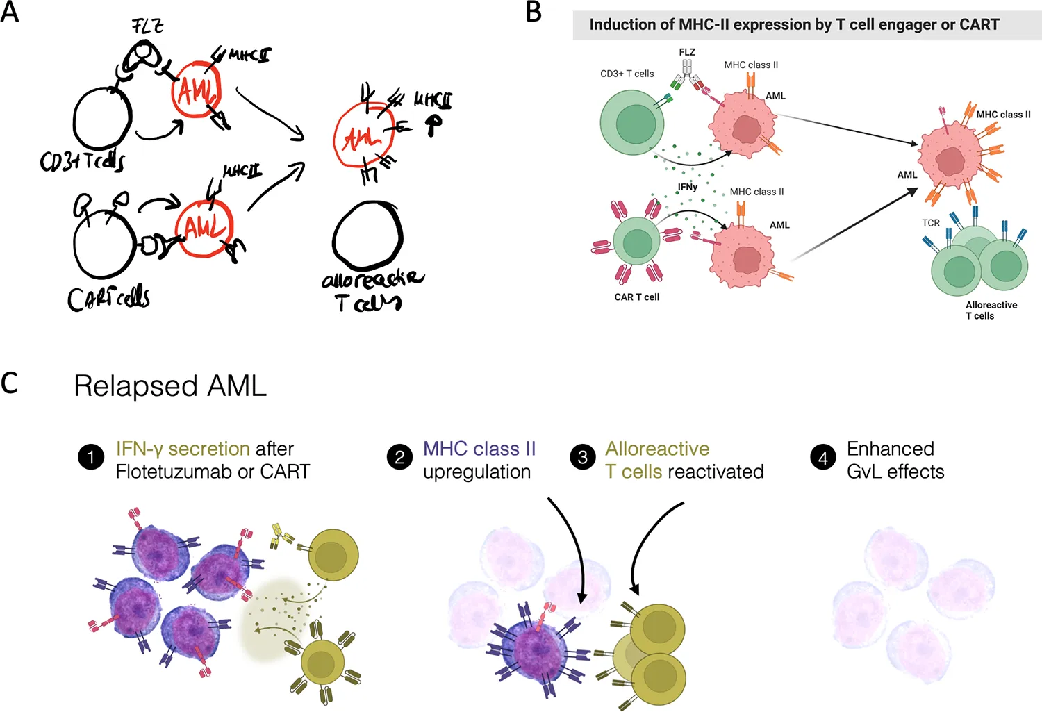
The publisher version is available under a Creative Commons Attribution 4.0 licence. The hero image is Figure 1 from the paper, showing the evolution from sketch to rapid prototype and final artwork; the authors also released that figure’s drawings through Figshare under CC0.
How should you define the message and audience?
Write the one conclusion your intended reader should retain before you begin drawing. A domain specialist, journal editor, investor, clinician, and general reader bring different background knowledge, so the same paper may need a different visual emphasis for each audience.
A practical message statement has three parts:
- Context: what system, population, material, or problem is being studied?
- Change or relationship: what was tested, compared, discovered, or explained?
- Implication: why does this result matter to the intended reader?
Try completing this sentence: “We show that [finding] occurs through [mechanism or evidence], which matters because [implication].” Then remove any clause that the graphical abstract does not need to show.
The source paper notes that a graphical abstract normally works alongside the written title and abstract. It should help people screen, recognise, and explore the research, rather than promise complete comprehension on its own. Our graphical abstract design guide explains how to turn this message statement into a visual brief.
Which visual elements should you choose?
Choose the simplest visual elements that preserve the scientific meaning and use one coherent illustration language throughout. Mixed icon styles, inconsistent perspectives, and arbitrary levels of detail make a composition feel assembled rather than designed.
Use pictograms when the reader needs to identify familiar entities quickly. Use a custom diagram when relationships, spatial organisation, or mechanism matter. Use microscopy, photography, or data when the evidence itself is the story and cannot be represented honestly by an icon.
Useful licensed scientific icon sources include the Reactome Icon Library, Servier Medical Art, and Bioicons. Check the licence for every asset, retain attribution records, and adapt only when the licence permits it.
Before combining visual elements, check:
- line weight and edge treatment;
- perspective and scale;
- colour saturation and contrast;
- biological or anatomical specificity;
- whether repeated entities look identical;
- whether each asset’s licence permits the intended use.
When should a graphical abstract include data?
Include data only when the result itself is more informative than a symbolic representation of it. A small chart can make direction, magnitude, or comparison visible, but a publication figure copied into a thumbnail usually carries too much detail.
Prefer chart forms that readers can interpret quickly: a few bars or dots for group comparison, a short line for a trend, or a small number of slices only when composition is the actual point. Remove secondary ticks, legends, and categories only if doing so does not change the interpretation.
For complex analyses, show the analytical concept rather than a miniature version of every output. A simplified network may communicate connectivity; a restrained heatmap may communicate a pattern; and a labelled distribution may communicate separation. Keep the complete quantitative evidence in the paper.
The scientific data visualization guide covers chart choice, uncertainty, multi-panel figures, and accessible colour in more detail.
How should layout control the reading path?
Match the layout to the logic of the research and give the composition one visible entry point. Left-to-right sequences suit workflows and progression, cycles suit genuinely recurring processes, comparisons suit parallel columns, and multiscale stories suit nested or zoomed structures.

Common graphical abstract structures from Jambor and Bornhäuser (2024), Figure 5. Reproduced from the open-access article under CC BY 4.0.
The paper also highlights perceptual grouping. Proximity, similarity, boundaries, alignment, and white space can organise elements into meaningful units before the reader studies any labels. Use boxes only when a boundary has meaning; white space often creates a cleaner group.
Choose a layout by the relationship you need to explain:
| Research logic | Useful structure | Main risk |
|---|---|---|
| Sequential method or progression | Left-to-right workflow | Too many procedural steps |
| Feedback or recurring process | Circular pathway | Implying a cycle that the evidence does not support |
| Control versus treatment | Parallel comparison | Unequal scales or visual emphasis |
| Cause, mechanism, and outcome | Central mechanism | Crowding the centre |
| Organism to tissue to molecule | Nested or multiscale zoom | Unclear spatial origin |
| Several findings around one question | Evidence map | Giving every finding equal weight |
See seven graphical abstract layout examples for a closer comparison of these structures.
What should arrows communicate?
Every arrow should have a defined meaning that the reader can infer from direction, label, and context. Arrows may indicate movement, sequence, activation, inhibition, transformation, transport, or an annotation link; using the same arrow style for several of these meanings creates ambiguity.
Create a small arrow vocabulary before polishing the artwork. For example:
- solid arrow: sequence or movement;
- labelled arrow: transformation or treatment;
- blunt-ended line: inhibition;
- double-headed arrow: reversible relationship;
- leader line without an arrowhead: annotation only.
Use the same visual rule everywhere. If two arrow types differ in meaning, make that difference visible through shape or end marks, not only through colour.
How much text should you use?
Use text to remove ambiguity, not to retell the manuscript. Short labels, action verbs, and message-led headings work better than paragraphs or unexplained abbreviations.
Text and visuals should be integrated. Place labels next to the objects they describe, label unusual symbols directly, and use the same wording as the manuscript where scientific precision matters. Avoid a distant legend when direct annotation can do the job more efficiently.
A useful test is to hide the text temporarily. The overall relationship should remain visible. Then restore the labels: each one should clarify an entity, direction, condition, or conclusion that the image alone cannot communicate reliably.
How should colour support meaning and accessibility?
Use colour consistently and sparingly so that a colour change always signals a meaningful change. Colour may highlight the focal result, distinguish conditions, encode a numerical scale, or preserve the natural identity of an object.
For quantitative information, ColorBrewer helps distinguish sequential, diverging, and qualitative palette logic. For interface and text contrast, the WebAIM Contrast Checker provides a useful accessibility test.
Do not rely on red versus green as the only distinction. Add labels, shape, line style, or position as a second cue. Review the design in grayscale and with a colour-vision simulator, then verify that essential labels remain legible at the final display size.
Which software should you use?
Use software that can produce the required dimensions and preserve editable, high-quality artwork. The paper discusses vector tools such as Adobe Illustrator and Inkscape, presentation software such as PowerPoint, and web-based platforms such as BioRender, Canva, and Figma.
The best tool depends on the task:
- PowerPoint: accessible for structured diagrams and journal-ready layouts when the canvas and export settings are controlled;
- Inkscape or Illustrator: stronger for custom vector illustration, precise typography, and reusable components;
- BioRender or icon libraries: efficient for standard biomedical objects, subject to licence and style constraints;
- 3D or image software: appropriate when spatial form, material texture, or anatomy cannot be explained adequately in flat icons.
Keep an editable master file, retain vector elements where possible, and export only after confirming the target journal’s current specifications. The Elsevier graphical abstract requirements checklist is one publisher-specific starting point.
How should you collect feedback?
Ask reviewers to explain what they see rather than asking whether they like the design. Specific comprehension questions expose problems that aesthetic opinions often miss.
Test at three stages:
- Message sketch: ask whether the central claim is accurate and worth showing.
- Visual draft: ask where the eye goes first and what each arrow means.
- Final artwork: ask for a ten-second interpretation at thumbnail size.
Include at least one domain expert and one reader who is not deeply involved in the project. The expert checks scientific fidelity; the less familiar reader reveals assumptions, jargon, and unclear visual relationships.
Useful prompts include:
- What did you notice first?
- Where did you start reading?
- What changed between the left and right sides?
- What does this arrow mean?
- What is the main conclusion?
- Which element could be removed without losing the message?
What is the final graphical abstract checklist?
The final review should test message, scientific accuracy, visual hierarchy, accessibility, and technical delivery separately. A polished image can still fail if it overstates the evidence or becomes unreadable at the journal’s real display size.
- One audience and one central message are defined.
- The chosen layout matches the research logic.
- The entry point and reading direction are obvious.
- Icons share a consistent style, scale, and perspective.
- Every arrow has one clear meaning.
- Data are simplified without changing interpretation.
- Text is concise, direct, and legible at thumbnail size.
- Colour remains understandable in grayscale and for colour-vision differences.
- Asset licences and attributions are recorded.
- The file meets the journal’s dimensions, resolution, and format requirements.
- A domain expert has checked scientific accuracy.
- An unfamiliar reader can explain the main message after a short viewing.
The original PMC article remains the primary source for the full ten-rule framework and its references. For examples across graphical abstracts, mechanisms, and data-rich research figures, view our selected visual communication cases. To develop a publication-ready visual around a manuscript, target journal, and deadline, contact Lattice Visual.