Visual Abstract vs Graphical Abstract
Compare visual abstracts and graphical abstracts by purpose, format, content, audience and the situations where each approach works best.

Scientific illustration and research communication studio
Published 27 July 2026
Last updated 27 July 2026 · 6 min read
Is a visual abstract the same as a graphical abstract?
Visual abstract and graphical abstract often refer to the same broad idea: a concise visual summary of a research paper. In practice, “graphical abstract” more often describes an image-led scientific narrative, while “visual abstract” can describe an editorial card that combines a key figure, short text, and publication identity.
There is no single definition used by every publisher. Elsevier’s graphical abstract guidance explicitly refers to journals requesting a “graphical” or “visual abstract”, showing how closely the terms overlap.
The safest interpretation is operational: inspect the target journal’s examples, dimensions, submission field, and content rules. The required artefact matters more than the label.
What is a graphical abstract?
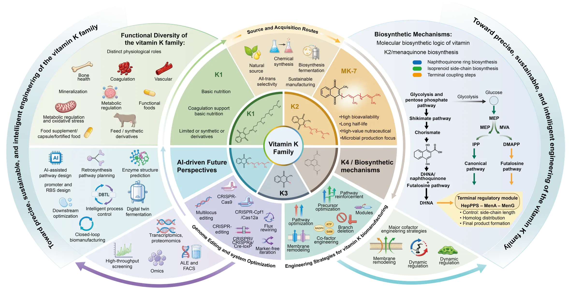
A graphical abstract is usually one image that communicates the paper’s central question, approach, and finding through a deliberate visual sequence. It may use diagrams, rendered objects, data summaries, microscopy, or a combination of these elements.
The best graphical abstracts are not compressed posters. They remove procedural and secondary detail so the paper’s logic can be understood quickly. A reader should be able to identify:
- what system or problem is being studied;
- what intervention, mechanism, or comparison matters;
- what changed or was discovered;
- how the elements relate to one another.
This format suits mechanism-led studies, materials research, treatment pathways, experimental workflows, and other papers where relationships are easier to understand visually than through a headline alone.
See our step-by-step graphical abstract guide and selected graphical abstract work for concrete structures.
What is a visual abstract?
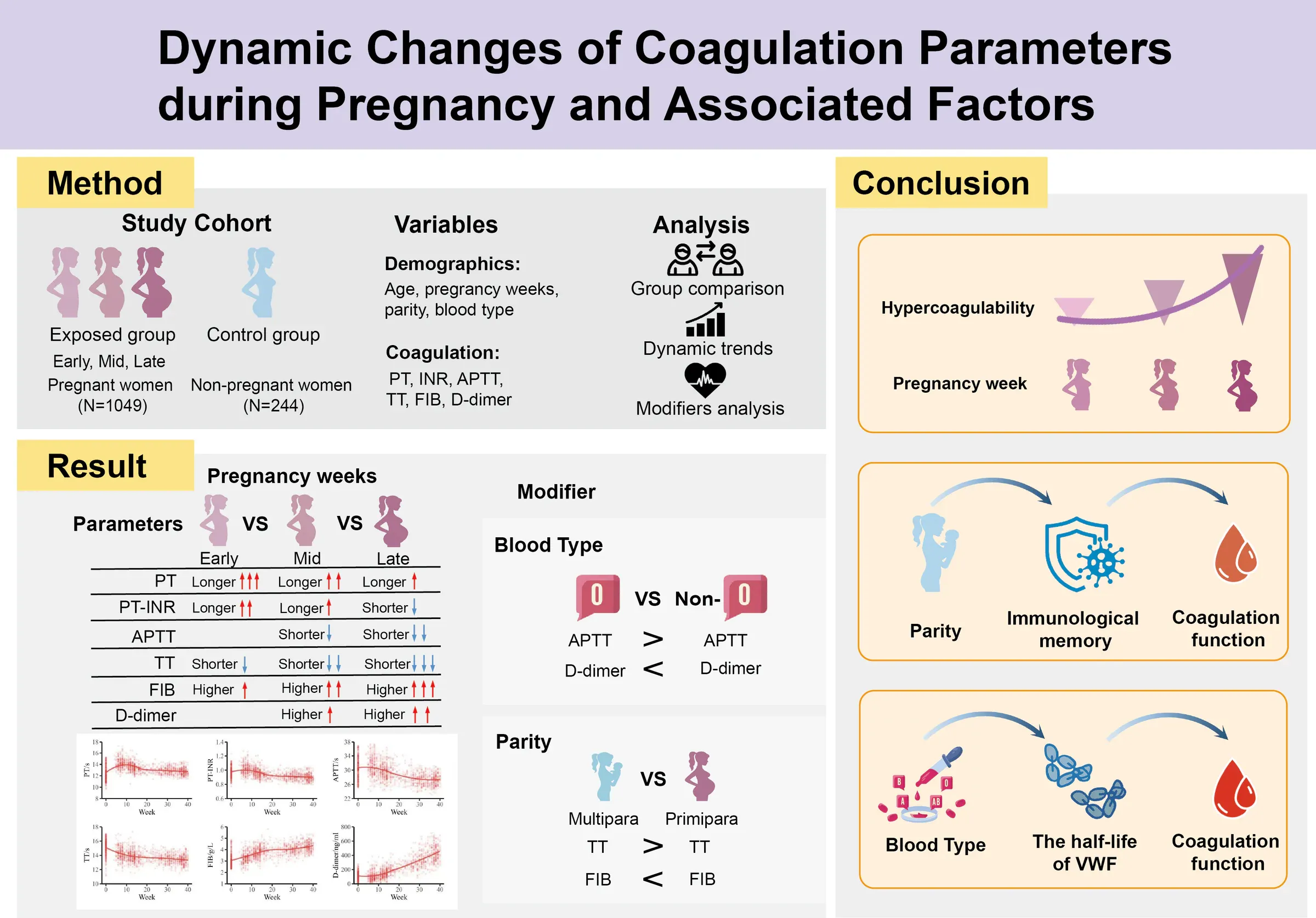
A visual abstract is often a more editorial summary designed for fast scanning on a journal website, social channel, conference feed, or institutional page. It may feature one result, a short headline, a small number of supporting statements, and stronger publication branding.
Compared with a detailed scientific diagram, a visual abstract may:
- use more plain-language text;
- foreground one result rather than the complete mechanism;
- present a chart or central figure inside a branded frame;
- include author, journal, or article information;
- be optimised for square, portrait, or social-media dimensions.
This does not make it less rigorous. It changes the communication job. The visual abstract often answers “Why should I read this?” while a graphical abstract more often answers “How does this study work?”
How do the two formats differ?
The practical difference is the balance between scientific depiction and editorial framing. Both formats should remain accurate, selective, and legible.
| Feature | Graphical abstract | Visual abstract |
|---|---|---|
| Primary job | Explain a scientific story or mechanism | Surface a key finding for rapid scanning |
| Typical content | Objects, pathways, workflows, outcomes | Headline, key figure, short supporting text |
| Visual identity | Usually artwork-led | Often publication- or campaign-led |
| Common use | Journal submission and article discovery | Web, social, editorial and conference promotion |
These are tendencies, not universal rules. Some journals call a fully illustrated mechanism a visual abstract; others call a branded results card a graphical abstract.
Which format should you choose?
Choose the format required by the publication or channel, then match the structure to the audience’s first question. If the journal provides a template or sample, use it as a specification rather than an optional inspiration.
Choose an image-led graphical abstract when:
- the paper’s value lies in a mechanism, process, material architecture, or causal sequence;
- spatial relationships are important;
- the intended audience already understands the specialist vocabulary;
- the image must function as part of the formal submission.
Choose a more editorial visual abstract when:
- one result or comparison deserves immediate emphasis;
- the audience includes non-specialists, stakeholders, or social readers;
- the design needs a headline and publication identity;
- the same story will be adapted into campaign or presentation formats.
Can the same design serve both purposes?
The same scientific story can serve both purposes, but the final files usually need different composition, dimensions, and text scale. Reuse the content architecture, not necessarily the exact exported image.
A modular workflow works well:
- identify the one defensible take-home message;
- build a clean scientific core containing the essential objects and relationships;
- export the journal version to the required dimensions;
- adapt the core into a social or editorial frame with larger type and fewer details;
- review both versions independently for accuracy and legibility.
This approach avoids stretching a wide journal graphic into a square crop or shrinking a text-heavy visual abstract until the labels disappear.
What information belongs in each format?
Both formats need a clear subject and a defensible outcome, but they distribute information differently.
For a graphical abstract, prioritise:
- the studied system;
- the key experimental or mechanistic relationship;
- the intervention or comparison;
- the principal result;
- a directional reading path.
For a visual abstract, prioritise:
- a plain, accurate headline;
- the most important result or implication;
- one supporting figure or visual;
- essential context such as population or method;
- article and source identification where required.
Avoid copying the written abstract into either format. Dense paragraphs make the reader work harder and reproduce information already available elsewhere.
How should you handle dimensions and journal rules?
Treat dimensions and journal rules as channel-specific. Elsevier, for example, gives a standard minimum of 1328 × 531 pixels at 300 dpi for its graphical abstracts, but individual journals can set different requirements.
Our Elsevier graphical abstract checklist covers its current baseline. For other publishers, open the journal’s official Guide for Authors and verify:
- required or optional status;
- accepted dimensions and file types;
- whether text or branding is permitted;
- where the file will appear;
- third-party asset and generative-AI policies;
- accessibility or alternative-text requirements.
Do not infer one journal’s rules from another journal’s examples.
How do you test whether the design works?
Test whether a reader can identify the subject and principal outcome without reading the manuscript. Use a reduced-size preview because both visual and graphical abstracts are frequently seen as thumbnails.
Run four checks:
- Ten-second comprehension: Can a colleague state the main message?
- Thumbnail legibility: Are essential labels readable at expected display size?
- Reading order: Is there one obvious place to start?
- Claim accuracy: Does the visual avoid implying more certainty than the data support?
Also test grayscale and colour contrast. If red and green are the only signals separating conditions, add labels, patterns, or shape differences.
What is the practical decision?
The practical decision is simple: follow the target channel’s specification and choose the structure that communicates the key research message with the least friction. Use “graphical abstract” and “visual abstract” as search and submission terms, but do not assume they guarantee a universal format.
If you need a reusable starting point, explore the graphical abstract starter resource. For a custom journal and campaign system built from the same scientific core, start a project with Lattice Visual.